
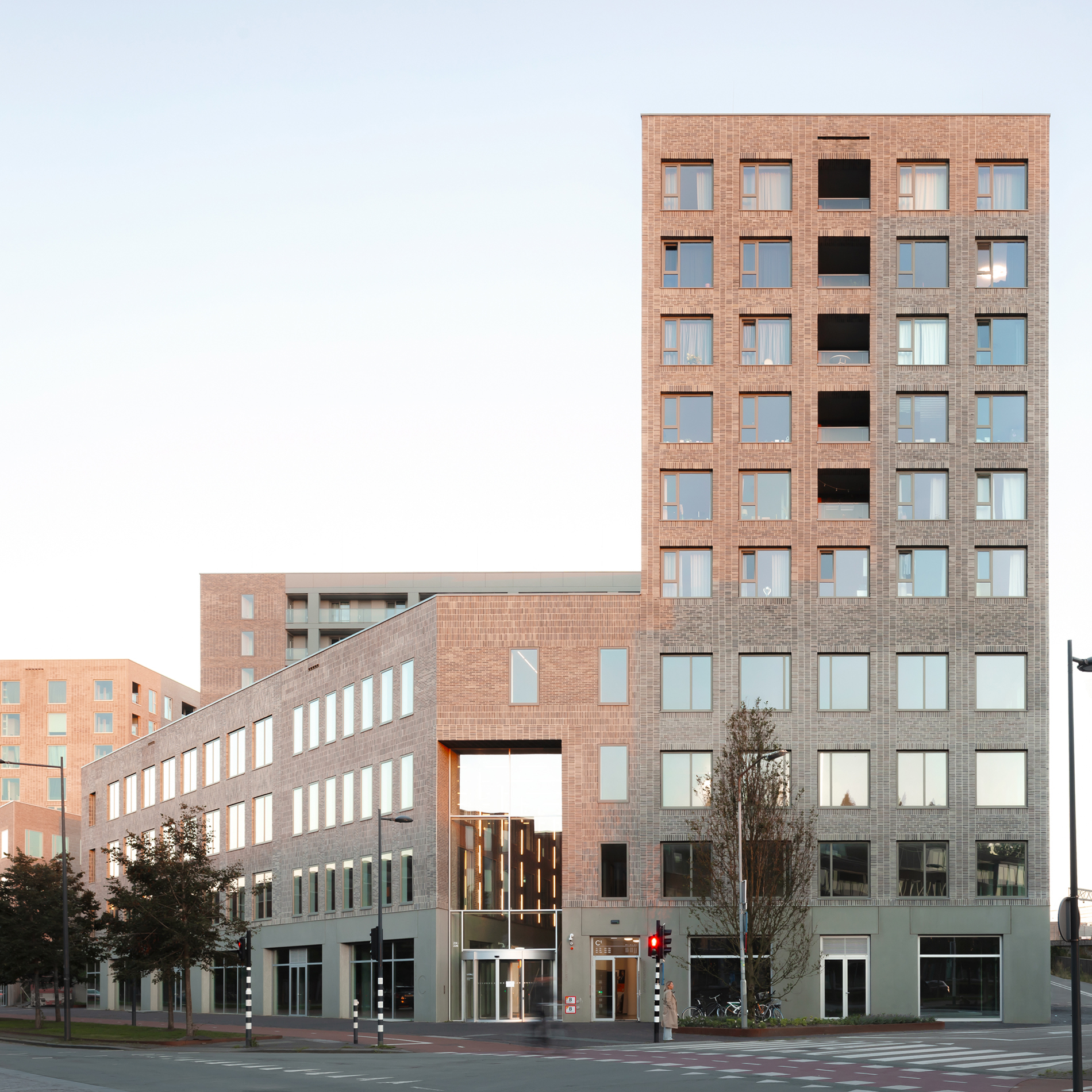
Domūs Houthaven
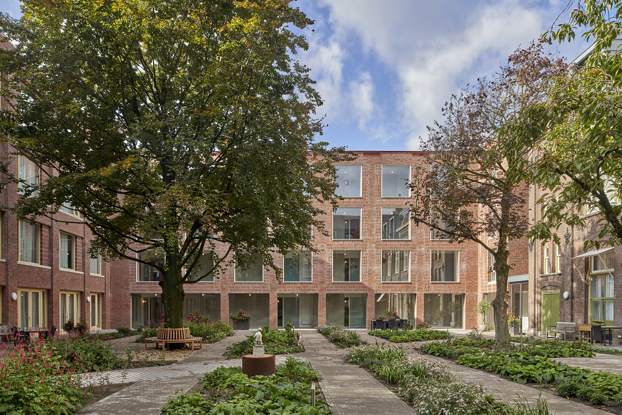
Domūs Houthaven is a residential ensemble featuring 235 smart compact apartments and an array of shared facilities on a plinth of commercial spaces The complex is designed as a family of interconnected blocks surrounding a raised communal courtyard. The interconnectedness and the generous collective facilities encourage interaction among residents. In Domus, you live alone, or as a couple, without being alone.
The ensemble forms the final keystone of the superblock on the northwest edge of Amsterdam’s Houthaven, which is in the process of being developed into a new residential neighborhood.

Domūs Houthaven is the first realization of Domūs Living, an innovative urban concept developed by Shift, Synchroon and …,staat creative agency. Domūs Living combines compact apartments with the benefits of shared amenities, public services and a community nearby. It enables sustainable high-density residential buildings that use space, energy and materials efficiently. The concept targets the growing group of one- and two- persons households that put social contacts and experiences above ownership. They are open to different forms of sharing, not only because it is sustainable but also because it is fun and valuable. For example, because it prevents loneliness. Domūs is also responding to the growing group of people who like to work “from home not from home”.


The volumetric design of the project follows the principle of unity in diversity. The individual blocks – with an own grain size, facade rhytm and color – feature distinct apartment typologies and access. This differentiation enables identification with one’s own home within the large-scale complex and reduces the project to a scale consistent with the characteristic grain size of the new urban district.


To strengthen the cohesion between the different building volumes, they share the same architectural DNA. The choice of rational brick volumes with generous facade openings and robust detailing refers to the industrial character of the harbor area. Each building volume has its own masonry grid with varying depths of recesses. These grids bring together mass and transparency in such a way that daylight, views and privacy are tailored to the specific type of apartment per block.


The building volumes are visually separated and at the same time physically connected by a common circulation space. Placing the blocks slightly apart creates entrances and corridors with plenty of daylight. Not only do they connect all the dwellings, they also open up a range of communal facilities as well as the communal garden for all residents. Placing two blocks further apart on the south side creates an opening that provides the garden with sunlight and views. To maintain connectedness within the ensemble, the gap is bridged by an aerial bridge on the fifth floor.


The communal facilities are geared toward various forms of everyday use. All residents have access to a multifunctional work- and livingroom next to the communal garden and a spacious cooking studio with roof terrace on the fifth floor. The work- and livingroom forms the social heart of the residential ensemble. The space is open and flexible and at the same time homely. Shift designed four large freestanding pieces of furniture that function as room dividers. They create different places and allow multiple activities simultaneously without affecting the continuity of the space. People work, eat, play and hang out. In addition, both large and small group activities take place. The integration of a laundromat and the manager’s office bring additional hustle and bustle.


The roof pavilion accessible via the air bridge houses a cooking studio and a guesthouse. The cooking studio is designed as a glass house with an unobstructed view of the Spaarndammer neighborhood. It is equipped with a professional cooking island and seating for groups both inside and outside on the roof terrace. The guest room is equipped with a bathroom allowing residents to have their guests stay here independently. In the belly of the building, under the communal garden, is a generous bike shed for nearly 500 bikes and a double-level parking garage with 70 parking spaces including 5 for shared cars.


communal facilities and apartment types

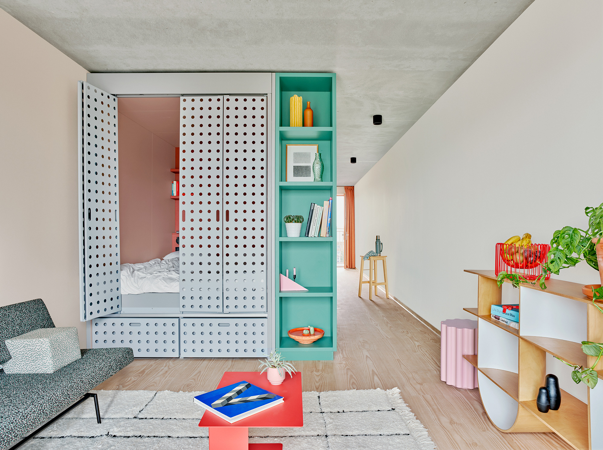
All apartments offer a high degree of spaciousness and flexibility, despite their compact area of between 43 and 60m2. They all contain a smart living core consisting of a configuration of modules for (open) kitchen, bathroom, closet space and bed alcove. In this way, the remaining space, the actual living space, is maximized both in size and in terms of use. Each module of the smart core has its own color. This gives the furniture a sculptural effect that underlines and enhances the specific character of each apartment type. The polychrome furniture piece contrasts with the concrete ceiling that has been left untreated.


The alcove bed frees the home from a bedroom without lapsing into the solution of a regular studio apartment where you actually live in your bedroom. When the alcove doors are closed, you have one large living space. Once the perforated doors of the alcove are open, the space transforms into one large bedroom. Such a solution makes use of the fact that the privacy offered by separate bedroom is not an issue in single-person household or cohabiting couples.


The plinth of the ensemble seeks to connect with the neighborhood by providing spaces for public amenities. The first functions to appear here soon will be a gym, a daycare center and a Domus café. This café is connected to the collective work- and livingroom and establishes a symbiotic relationship with it.


Matryoshka house
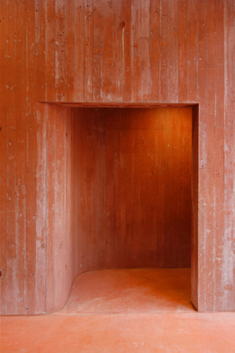
Matryoskha House transforms an early 20th century townhouse into two high-end apartments by radically opening it up. Situated in the center of Rotterdam, the house was in a derelict state due the previous owner’s conversion of it into a sub-standard workers’ hotel. Bothered by the neglect, a neighbor acquired the property and gave Shift architecture urbanism the commission to give it an extreme makeover.

The house was stripped to nothing but its envelope and flooring structure, the later partly removed in each unit to create double-height living spaces. The private spaces are suspended in these tall spaces creating the matryoshka effect: a box within a box.
The lower apartment features double-height spaces at both the front and rear façade, isolating the volume of the bedrooms and bathroom as floating in its center. The two voids provide the living areas of this 14m deep half-basement level with plenty of daylight.
The upper apartment is conceived as an inversion of the mass-void relationship of the lower apartment. Here the bedrooms, rather than the voids, are placed against the façades, opening up a spectacular double-height space at the center of the apartment, brightly lit by a large skylight.


The historic elements of the street façade were restored. The rear façade was removed entirely and replaced by a portal frame construction in galvanized steel providing structural stability. A large sliding door and three floor-to-ceiling double doors ensure that both living rooms can be fully opened up towards the garden.

In the center of the apartments a single galvanized steel cladded volume incorporates stairs, toilets, storage spaces and kitchen equipment. A free-floating kitchen island finished in white tiles stands at the heart of each apartment.


The interior of the house is a dialogue between old and new, contemporary and traditional, polished and rough, finished and unfinished. When possible original details of the old house were preserved.
Brickwork was left exposed and roof trusses left bare, stained glass window panes were restored and placed within new frames. Warmer materials and colors balance the use of reflective metal, concrete and black steel.


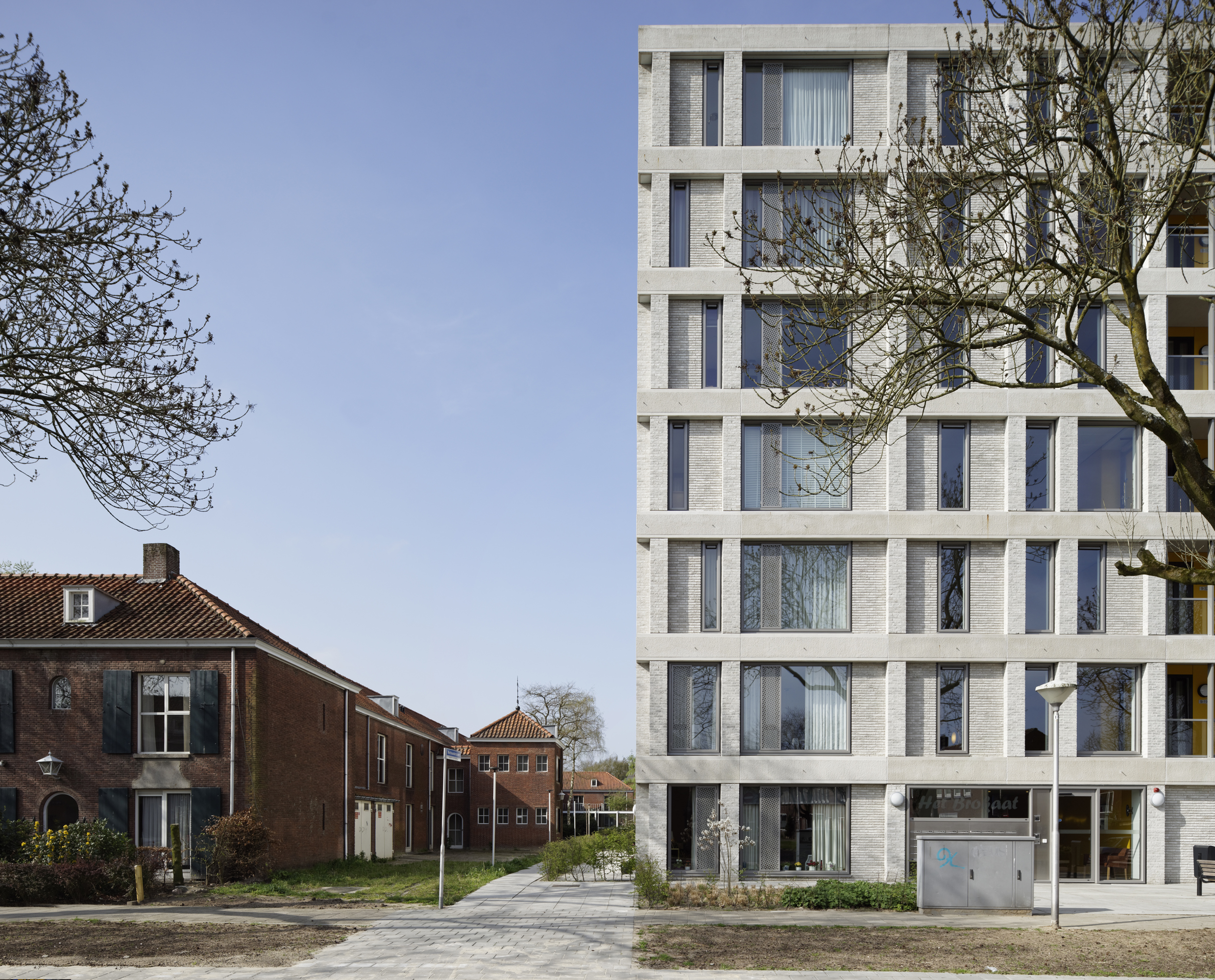
5TRACKS
Following the arrival of the high speed train from Amsterdam, the entire station district of Breda has undergone a complete urban renewal. The new world-class station terminal now bridges both sides of the rails, connecting the previously isolated northern side of the city in a seamless way to the historical centre. That gives the chance to redevelop the (former industrial) sites situated north of the rails into a prolongation of the city centre, a new meeting place of the city. 5TRACKS is one of them, forming the final piece of large scale development on the west side of the station (urban design by Claus en Kaan architecten, 2010). It accommodates a mixed program with living, working, recreational and commercial facilities. The high density and varied program creates a dynamic city environment which promotes the sharing of facilites by different users and urban encounters.

5TRACKS is designed as an ensemble of three buildings with two identities: one towards the city and one towards the railway. At the north side, along the new Stationslaan, the ensemble presents itself as a continuous city wall that relates in scale, material and height to the oppositely situated neighborhood Belcrum. At the south side, along the train tracks, it features a sequence of higher triangular buildings in a park, aligned like a zigzag “hedgerow landscape”. The design follows closely the guidelines of the masterplan by Claus and Kaan architects, which envisioned the “hedgerow landscape” along the railway as a means to create a qualitative entrance to the city. This artificial scenic landscape formed by buildings and vegetation elements in the park ensures depth and a layered perspective for the train passenger and a green buffer for the users of the buildings close to the rail.


The spatial and programmatic organization contribute to the two-sided orientation of the plan, activating both the street side and park side. A unitary plinth with bars, restaurants and other commercial functions towards the Stationslaan makes for a lively route in between the station and the Court building, situated further to the West. Behind it and stretching until the rails, a parking garage occupies the entire ground floor. On top of it, three triangular building blocks house offices and the hotel. Their northern façades build up the 16m tall profile towards the Stationslaan, while the southern façades create the zigzag “hedgerow” structure, which opens up with collective facilities towards the park. The triangular blocks are topped by V-shaped slabs towards the park which contain different types of apartments and hotel rooms. These are all oriented to optimally profit from the sun and view towards the historic centre of Breda and make use of the collective gardens on the roof of the triangular blocks.


plans
One of the challenges of the project was to make sure that the park is not just a decorative piece of green trapped in between the buildings and the rails, but an integral part of the city.
The organization of program in three distinct buildings leaves room for generous connections between the Stationslaan and the higher situated park. The height differences are bridged by inviting stairways and ramps where the vegetation is literally pulled down to announce the park at the street level. The parking deck is covered with a 50cm -90cm earth substrate in which a vegetation of grasses and groups of birch trees are ordered to form the hedgerow structure. Several thematic squares featuring terraces, outside working and meeting places charge the park with activity.


Additional to the public connections in between the volumes, each buildings has a central atrium which relates to both the park and the street. The atria are conceived as voids sculpted in the building mass and separated from the outside with very transparent facades, so that indoor and outdoor run seamless into each other and the park and the city literally meet. The various collective facilities situated here provide synergetic moments where the resident, the entrepreneur and the passerby come in contact with each other.


Within the project, recycled ceramic stone strips from Stonecycling will be applied on a large scale for one of the first times in the Netherlands. With this application, around 385,000 kilos of construction waste material will thus be incorporated into the project’s facades. The wide variety of “masonry bonds” maximises the potential of the stone strips. The use of sawn strips makes full use of the bricks, but also creates a differentiated image of baked and sawn strips in the façade.


Museumplein Limburg
Museumplein Limburg is a trinity of complimentary museums combining design, science and technology in one museum district in Kerkrade, a town at the Dutch-German border. The existing Continium (a discovery centre for science), has been extended with Cube (a design museum consisting of exhibitions and exploratory labs) and Columbus (housing a unique Earth Theatre and a 3D cinema), as well as a wide range of public facilities for events, workshops and education.
Capitalizing on the strategic location, the museum quarter formalizes the entrance into Kerkrade for both train passengers and visitors arriving by car from the main access road.

The brief required the extension of the existing museum with two new institutions, each with an own identity, but which can also function as a whole. Our answer is an ensemble of clearly recognizable volumes connected by an elaborate underground public space.

Above ground, a cube and a sphere, spectacular in their absoluteness, provide the two new institutions with distinct identity. With their pure geometry and omnidirectional orientation, the cube and the sphere counteract the amorphous and introvert character of the existing museum. However, their iconic character doesn’t make them into isolated urban objects. Together with another primary solid, the 80m long beam which doubles as a giant canopy, they are carefully placed in relation to the nearby station to articulate the public route between the station and the city centre. On this public walkway, the volumes reveal themselves towards the pedestrians with lively areas such as the entrance hall underneath the beam and the design labs underneath the cube.

Underground, the sunken square, the best feature of the original museum, is extended underneath the new volumes. A continuous landscape is created that connects all the facilities of the museum district, both old and new, and allows them to function as a single whole.


The new enlarged sunken square forms the heart of Museumplein Limburg. It extends seamlessly underneath the beam that hovers above the double height entrance hall. This linear entrance hall serves as the logistic backbone of the whole museum district. Visitors descent via one of two wide staircases at both ends: one orientated towards the train station and the other towards the town’s centre.


In addition to the new museum square and entrance hall, the underground landscape hosts a restaurant, an enclosed patio and two tunnels connecting to Cube and Columbus.


All stairs, walls and floors of the underground landscape are made of a uniform earth tone concrete to emphasize the connective character of the space and to create the suggestion of an excavation. The walls were poured in a formwork of rough wooden planks adding a tactile quality that contrasts with the abstract volumes above ground. The excavation out of red concrete, combined with the experience of descending below ground, refer to the mining past of Kerkrade.


Floorplans

Content-wise, Museumplein Limburg aims to be a “museum without boundaries”. As opposed to the static vision of the museum as an island offering a passive escape from reality, the “museum without boundaries” is an interactive workshop where visitors are regarded as participants rather than spectators. They discover the world and their place in it through interaction, participation and debate.
Our ambition was to translate this concept architecturally by blurring the boundaries between museum space and public space, and make Museumplein Limburg an integral part of Kerkrade.

By situating a large portion of functions underground, the built footprint on the ground level was minimized, thus leaving space for public walkways to criss-cross the museum district. The route to and from the train station, designed as a scaled up zebra crossing, creates a visual dialogue between the museum district and station area and adds to the experience of both the museum visitor and the train passenger.

A transversal walkway, punching through the entrance hall, connects the sunken museum square to the district’s bus terminal in the forecourt. This walkway provides train and bus passengers direct access to the museum’s restaurant which can double as waiting room, transforming the museum square into a true extension of the public realm of Kerkrade.


The combination of public space and public transport with the museum district fits perfectly with the ambition of a “museum without boundaries”: even passers-by become participants.


Cube
Cube, one of the three attractions of Museumplein Limburg, is a design museum. The museum is aimed at an international audience interested in the process of designing. Simultaneously it functions as a permanent laboratory where students and designers co-create together with the public.

Cube is draped in a reflective curtain of coated steel that emphasizes the vertical character of the museum. The curtain effect is obtained by the random placement of vertical profiles of three varying folds that each reflect the light differently. The facade is cut open by two identical windows: one vertical that reveals the stacked exhibition floors, and one horizontal that provides the multifunctional space on the top floor with a panoramic view over the Limburg landscape.


The museum is housed in a perfect cube measuring 21x21x21 meters. A glass plinth creates the illusion of a volume floating above the red underground landscape. Together with the patio, this plinth allows for natural light and views into the space underneath where the design labs are situated. True to their programmatic role as interface of the museum with the outside world of regional education centers, business and manufacturers, the design labs form the showcase of Cube towards the public space of the city.


Cube is organized as a vertical exhibition machine with identical floors, creating space for an ever changing set of exhibitions. Each floor is divided between a „servant“ core (containing utilities, technical spaces and circulation) and a „served“ open space. This exhibition space is dark, generic and its prefab concrete structure is left unfinished. This gives curators and exhibition designers maximum freedom and flexibility to appropriate it according to any given theme.


The only specifically shaped element in Cube’s interior is the main staircase that links all gallery spaces of this vertical museum. It is made of identical straight flights which are variously rotated, creating the effect of a cascade falling down a 25 meters high void. Its generous dimensions allow it to function besides as circulation space as an extension of the exhibition spaces.


The top floor offers a multifunctional event space that can be partitioned in many different ways by means of a curved curtain system.


various spatial scenarios created with the curtains


Columbus
Columbus, one of the three public attractions of Museumplein Limburg, is a visualization machine for Planet Earth. The main message of the shows concerns the limits and the vulnerability of our home planet, its uniqueness, beauty and above all, its irreplaceableness. In the tradition of architecture parlante, it is housed in an ostensibly perfect volume: a sphere, half above ground and half underground. The spherical design draws inspiration from several visionary proposals in which the sphere stands symbol for the immensity, the sublime, the future, inclusiveness, shared experience and responsibility.


The lower half of the sphere accommodates the Earth Theatre, equipped with a spectacular – 16-meter wide and 9 meters deep – hollow projection sphere which can be viewed from two rings of glass balconies. This first built inverted planetarium offers visitors the experience of an astronaut looking back towards planet earth, featuring the effects of human inhabitation on Earth.


Besides pre-programmed movies which project the reality as seen from above, the theater is designed for the visualization of big data. In the near future, with a projection system operating in real-time, the users will be able to navigate through a predefined database to view and interact with future scenarios regarding the development of our cities, regions and the planet. The sheer scale and dramatic setting of the Earth Theater will enhance the perception intensity and understanding of the visualized big data. The theater becomes a machine providing people the unprecedented power to understand, analyze and make decisions about, and thereby ultimately change the world we live in.


The upper half of the Columbus Sphere, underneath the dome, is occupied by a circular auditorium. It can be reached by a glass bridge from the entrance hall via the Beam building or through an internal stair that descends into the Earth Theater. The auditorium functions independently for lectures and conferences and as a National Geographic 3D cinema or in combination with the Earth Theater, as a platform for dialog and debate after the visualizing experience in the inverted planetarium.


Columbus’ cupola is made of two shells of shotcrete. The concrete was sprayed on a permanent geodesic scaffolding filled in with triangular plates of EPS isolation. The seamlessness of the shotcrete skin emphasizes the absolute form and its density guarantees sound insulation from the loud shows inside.
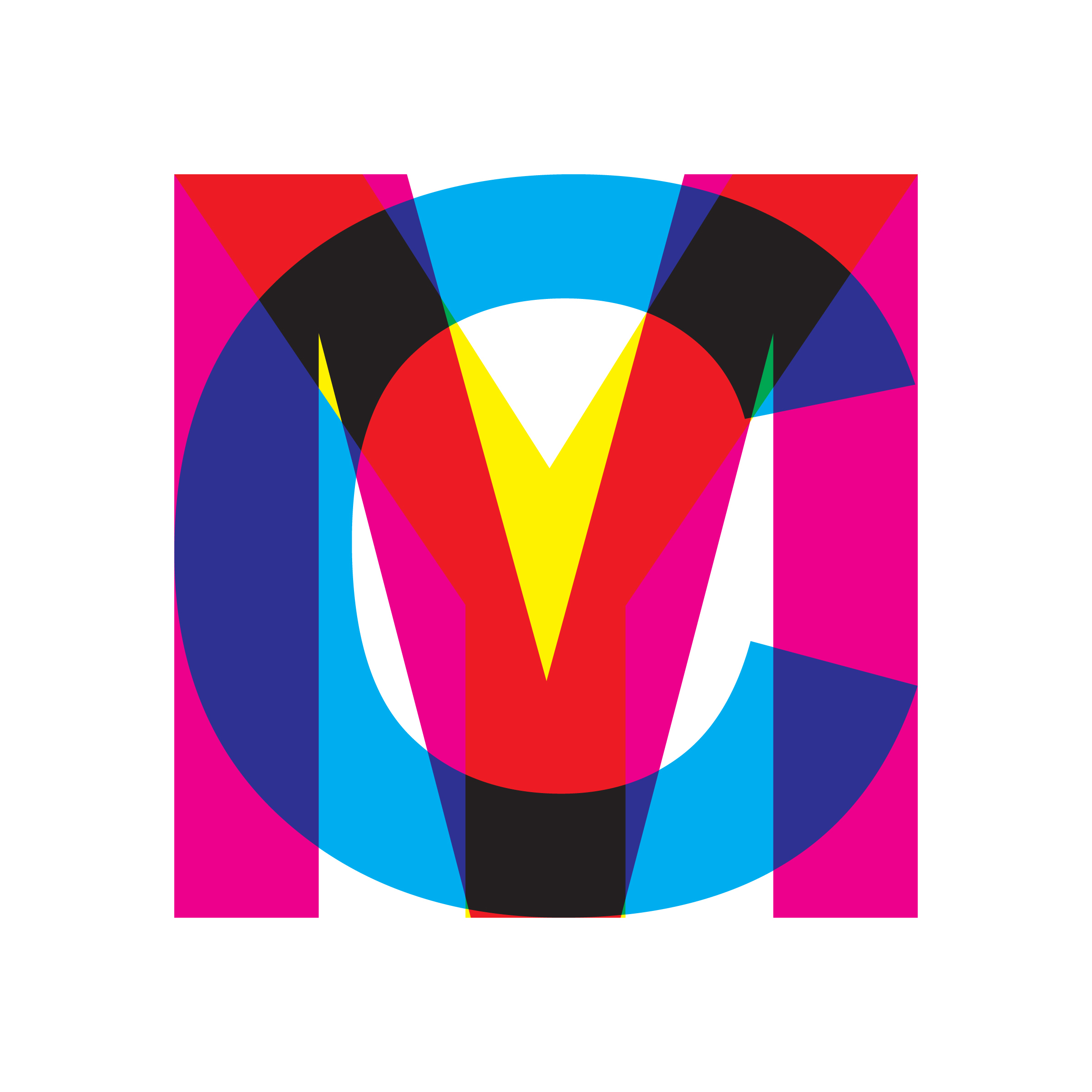

CMY pavillion
The CMY pavilion transforms the glass structure of Tschumi into a three dimensional graphic work that shifts its composition and color scheme with the viewpoint of the spectator.

The Tschumipavilion was originally built as a video pavilion for the city-wide exhibition-event “What a Wonderfull World” in 1990. Scattered around the city, five pavilions brought pop-music videos into the public realm. They were designed by the architectural avant-garde of the time, labeled two years earlier as ‘deconstructivist’ by the MOMA. The pavilions of Eisenman, Hadid, and Himmelblau disappeared, while the ones of Koolhaas and Tschumi remained.
Remarkably, it is OMA and Tschumi’s very different approach to program that have made their pavilions last. OMA’s programmatic alchemy, pairing of the pavillion with a bus stop, is the reason it survives today. Tschumi’s pavilion has persisted precisely because of the opposite reason: its lack of any precise program. Being a transparent envelope, it has been used as a public/urban event-space for temporary art projects since 1995.

In the middle of a busy roundabout in Groningen, Tschumi created one of the most transparent buildings ever built: its facades, roof as well as structure are made of clear glass. Tschumi chose glass for its reflective quality to create “instable facades” that would reflect the video images endlessly. These videos transformed the “invisible pavilion” into an “illusionistic spectacle” in which the virtual image from the reflections mix with the real image from the monitors and the city.

Shift’s intervention reinterprets the idea of “instable facades”. Instead of using the glass envelope to mix videos, the CMY pavilion uses the glass to mix colors. By applying translucent films in the colors cyan, magenta and yellow onto the glass, the pavilion turns into a three dimensional graphic piece that changes continuously with the movement of the spectator.


The colored pattern of diagonal bands that wrap around the building is derived from the rigid paneling system of the structure. Because of the parallel transparent facades, the color bands start mixing according to the subtractive color model. The overlap of the “real” primary colors on the glass create secondary “virtual colors”: C + M = Blue, Y + C = Green, M + C = red. The transparent pavilion becomes a dynamic color space with a strong urban presence.

From different angles come different experiences of the CMY pavilion. People circulating on the roundabout will experience continuously changing colors and patterns. Standing on the square facing its long side, one perceives a cross-hatch pattern in six colors (CMYRGB). One waiting for the bus with an oblique viewpoint sees the “actual pattern” of diagonals in three colors (CMY).

Inside another appearance is uncovered: here the colors mix with the city rather than with each other. Since there is no more overlapping of colors, the diagonal CMY color bands are clearly visible. Their diagonal wrapping enhances the destabilizing, girating effect that Tschumi intended by tilting the building.


Vertical Loft
This so called do-it-yourself dwelling in the centre of Rotterdam is part of a bold experiment initiated by the municipality to revitalize dilapidated urban areas. Run-down pre-war dwellings are renovated on the outside and brought back to their monumental appearance, while the interiors are stripped bare.

The empty shell dwellings are primarily bought by enthusiastic young people who transform them according to their specific needs, desires and budgets. Real estate developers have picked up the initiative and a new demand driven market of urban housing has been generated in recent years. The result is a growing number of contemporary custom-made dream houses within the uniform old fabric of the traditional nineteenth and early twentieth century city.

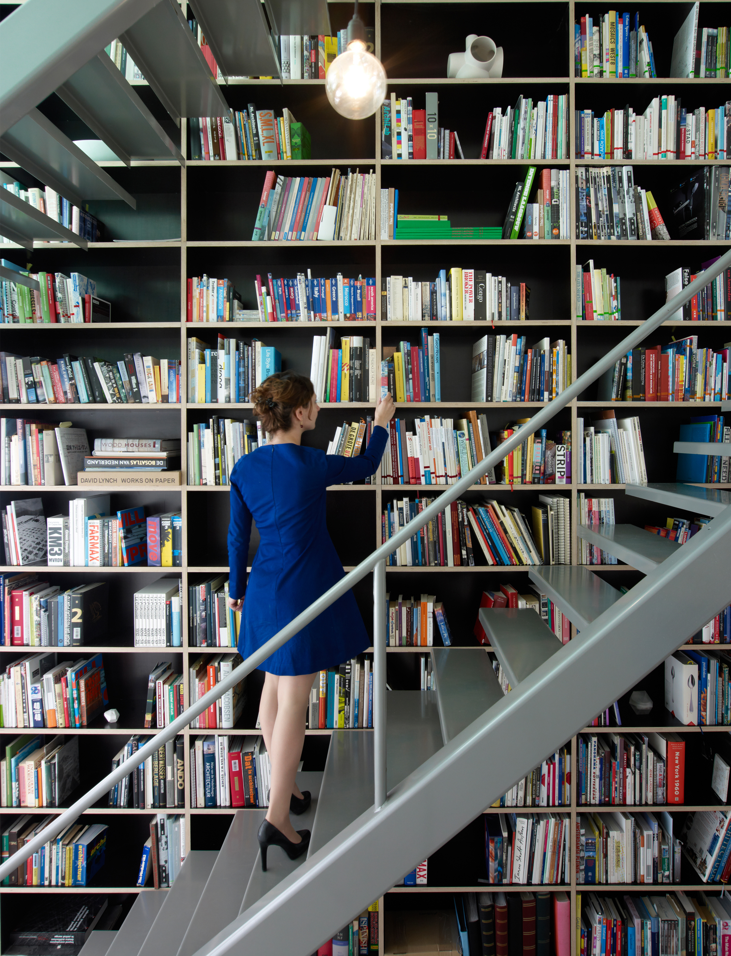
Vertical loft is a house without walls, where the three floors are stitched together into one continuous space. One oversized closet connects all the floors and functions as a storage device for the whole house. This piece of XXL-furniture, measuring 10 meters in length and 9 meters in height, replaces the load bearing middle wall of the original house. Its modular system integrates kitchen appliances, bookshelves, wardrobe, and a walk in closet.


The introduction of a central void reinforces the presence of the closet. The void enables diagonal views through the house in which the closet is experienced in its full height. It also makes daylight penetrate far into the 14 meter deep house. Two steel stairs in the void make the bookshelves accessible and create a vertical circulation along and through the closet.


The extreme makeover of the house is combined with a selective preservation of elements of the old casco. Industrial materials such as the phenol coated multiplex of the closet and the polyurethane flooring are balanced by the longitudinal brick wall that is left bare, the stained glass and the original doors that are restored and re-used. The roughness of the wall, full with traces of the past, tells stories about the continuous makeovers that the house has undergone in the last hundred years.


Transformation Oude Dijk monastery complex
The existing complex of the Oude Dijk monastic community is not tailored to offer elderly care for the monastery’s aging population. The assignment is to realize 100 elderly care apartments in the convent garden, while preserving the continuity and the exceptional green character of the garden.

The convent of the Sisters of Charity in the centre of Tilburg is a unique ensemble formed by buildings and their adjacent outer spaces including the highly maintained garden. This large green oasis brings the much needed tranquility within the urban field. From the first establishment in 1832, the complex and its garden is undergoing a process of continuous spatial transformations following the changing needs of the sister community, with the last generation of buildings from the 1980ies. We see the current assignment as a logical next phase in this ongoing process. The challenge is to develop a spatial concept that answers the current (housing) need while anticipating the moment when the complex will be fully inhabited by laymen and the garden will be open to the public.

Despite its central location, the complex has a limited physical relationship with the surrounding city, partly due to the intrinsic monastery function, but also to the fact that the city in its development has consistently turned its back to the monastery. By selectively opening the complex in strategic places towards the surrounding public space, we see an opportunity to take the monastery complex out of its isolation without sacrificing the private monastic atmosphere.

The starting point of the new design is the historical courtyard typology, present at several moments in the convent’s development. We propose three new courtyards at the edges of the convent’s garden, each with its own character and functionality. The new volumes forming the courtyards are not to be recognized as independent buildings, but rather as (decor) walls of the new (and existing) courtyards. They are subordinated to the overall figure of the ensemble by taking over the volume height and size of the existing.


In a first phase, the monumental wing of the “Oude Ontmoetings Centrum” (transformed into housing with high care level for psycho-geriatric patients) and a new volume at its west side (with medium care apartments) define two new courtyards. A private, closed courtyard forms a secure outdoor area for the psycho-geriatric patients. An open, city-oriented courtyard serves as an entrance square for both buildings and creates a new formal entrance to the adjacent city park (once part of the monastery garden, at this moment poorly accessible).
In the second phase, the outdated ’80ies central wing of the complex will be demolished. On its place, two new volumes, together with the western ’80ies wing, will define a new residential court. One of the new volumes sticks out through the current northern alignment of the complex, opening up the courtyard and announcing the presence of the complex towards the city centre. Perpendicular to it, the other new volume is positioned in such a way to create two openings towards the convent garden. The new residential court acts as a stepping stone between the city and the convent garden, spatially regulating the limited opening of the garden.

The materialization and façade design of the new volumes is derived from the urban concept of the courts, dictating the adjacent walls of a courtyard to have similar façades, and not the single volumes. This results in volumes with different “faces “, depending on the court they are oriented. When a façade is oriented to a monumental part of the monastery, the rhythm and proportion of the openings is adapted accordingly, when a façade is oriented to the garden, the design of the openings is more “free” and can therefore be maximized. These façade families along with the consistent use of a brick similar to that of the monument provide a sense of continuity in the overall ensemble between old and new. The flat detailing and the use of multiple bonds within the same plane create a contemporary look.


The new volume in the first phase has 4 floors, where the sisters will live in groups of 10 per floor. A transparent double-height entrance hall, placed in the corner of the entrance court, runs through until the garden and connects it visually with the city. The apartments are ordered by a common corridor, with most(8) oriented towards the garden and two on the entrance court. The corridor is generously lit via the closed courtyard and widens at the place of each apartment entrance. The relatively high surface requirements for care accessible housing combined with the desire to achieve a compact building has resulted in a particular typology of the apartments. These are made up of three naves, with the central nave functioning as both living room and connection between the other rooms.


The two new residential buildings of phase 2 with a total of 60 apartments create a new courtyard together with a renovated existing west wing. This residential courtyard functions as a buffer and at the same time as a future stepping stone between the city and the monastery garden. Both buildings have a fully sunken parking garage that allows the new residential courtyard to be car-free.

The north-south oriented residential building of phase 2 has a wide central corridor with entrances and daylight on which 36 relatively compact and affordable three-room houses are situated. The east-west oriented volume is accessed via three porches containing two luxury flats per floor, one with standard four rooms and one with standard three rooms. The very large nave dimension of 8.6m for residential construction, which is spanned in one go, gives residents a lot of freedom of layout.


The project brings biodiversity, water storage and reduction of heat stress in the middle of the city. The smart implantation of the new volumes maximises the preservation of existing greenery. This is combined with the generous planting of new vegetation and the placement of several nesting boxes.


Open house
Shift architecture urbanism has redesigned an historic family house in the “Indies Neighborhood” of Amsterdam to maximize its relationship with both the street and its garden. A multifunctional wall cabinet, 14 meters in length, plays a key role in opening up the ground floor. This furniture element contains all servant functions, allowing for one open and flexible space for living that spans between street and garden.

The relation to the street is emphasized by the absence of an entrance hall: one enters the house directly into the open living space. Thus, the house is linked to the attractive sidewalk with its vertical gardens, typical for Amsterdam. The seamless continuation of indoor living area into the private garden is strengthened by extending the wall cabinet into the garden to define a private terrace.


The juxtaposition of three contrasting finishes for the cabinet differentiates the main living space. Each material provides the space with a specific character that connects to its use: a warm plywood for the living, a sanitary pink laminate for the kitchen and dining area, and a weather resistant anodized aluminum for the terrace.

The plywood section of the cabinet integrates a small winter-entrance, a stair, TV & audio and a wardrobe. The part in pink laminate contains kitchen appliances and cupboards. Its arch-shape makes room for a recessed kitchen in black MDF. The last piece in natural aluminum accommodates a toilet and a garden storage. The aluminum cladding reflects the garden vegetation back into the house, enhancing the experience of the private garden, a true luxury in the old neighborhoods of Amsterdam.


In contrast to the common use and open character of the ground floor, the two upper floors are divided for a functional layout of individual rooms for this young family. The first floor contains a working space, a master bedroom with walk-in-closet and a bathroom for the parents. The second floor contains three small bedrooms and a second bathroom for their three kids.

Open House is an example of how the Dutch inner city housing stock can be adapted to the needs and desires of young families with kids, avoiding them to flee the city for its lack of (outdoor) space and appropriate dwellings. Urban residential areas such as the “Indies Neighborhood” should house multiple generations, cultures and incomes to remain attractive and socially sustainable.

Jozefzorg
This project deals with the redevelopment of an outdated care complex in Tilburg. Some buildings have to be kept, others need to be demolished. The new program consists of 120 apartments for seniors , 60 high care units and a local care center.


Our winning proposal introduces a meandering urban figure, a snake, that creates an intimate living environment for seniors along a series of open courtyards. It absorbs all program in one differentiated gesture whose form is derived from the existing comb-shaped monument with its typical open courts, an icon of post-war housing by architect Jos Bedaux. Two high-rise volumes at the perimeter of the site relate to the city, while the low-rise inside relates to the monument.

Two new east-west axis´ -one for car acces and one promenade- open up the site towards the adjacent neighbourhoods. The new courtyards relate towards these public routes without giving up their intimate quality. They function as collective garders for the inhabitants.
On the western side of the project area, the building frames the existing chapel and creates a new public square where the new housing, the monument and the city meet.


Plans groundfloor and first floor

The project will be realised in two phases. Phase one was completed in 2014. Its homogeneous grid facade emphasises both the horizonality of the urban figure and the verticality of the main housing block. The overall gesture is further strengened by the monochrome charachter of the light concrete in combination with the cemented brickwork.


Phasing


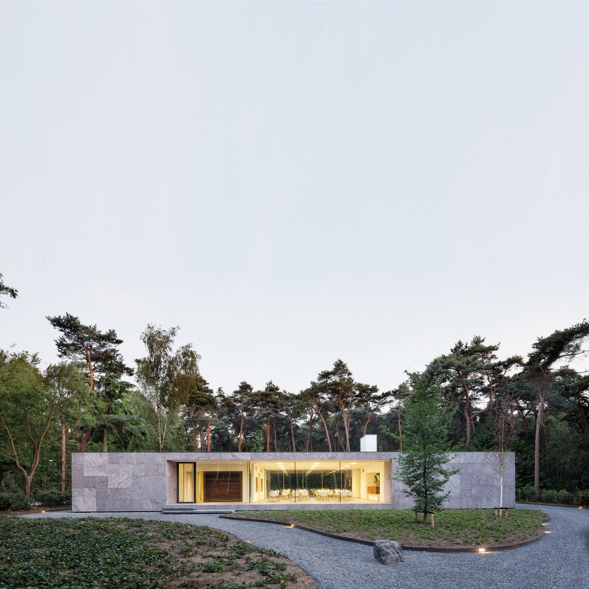

Faculty Club
The latest extension on Tilburg University’s campus is Faculty Club, a multipurpose pavilion for the academic staff and their guests. Our design reanimates the quintessential quality of the Tilburg campus: strong solitary buildings in the green. The monumental modernism of Jos Bedaux served as a frame of reference. Bedaux designed the first – still the best – buildings for the university in the sixties.


By creating a strong formal relation between the existing university buildings and the new Faculty Club, an ensemble of omni-directional solitaires is created. This enables one to recognize the Faculty Club as part of the university, despite its peripheral forest location and exclusive program.

The Faculty Club is designed as a carved-out-monolith, one simple box in which transparency and massiveness melt together. The central restaurant is carved out from the centre, creating a tunnel-effect in the front façade. In order to strengthen its solitaire character, the building is lifted from the ground. The height difference is bridged by outside stairs and a ramp integrated within the front façade.

Each façade has only one window. By recessing each window, outdoor spaces are created within the front and rear façades. These mark the entrance in front and form a large covered terrace in the back. The simplicity and plasticity of the three-dimensional window treatment further contributes to the building’s sculptural qualities.

The primary program consists of a restaurant for eighty persons, a lounge and two conference rooms. The secondary program consists of a kitchen, storage space and other services. The further the functions are situated from the campus, the more intimate and informal the space becomes. The conference rooms look out over the campus, while the lounge completely relates to the forest and the garden. All main functions are physically linked by a transparent axis running the length of the building.

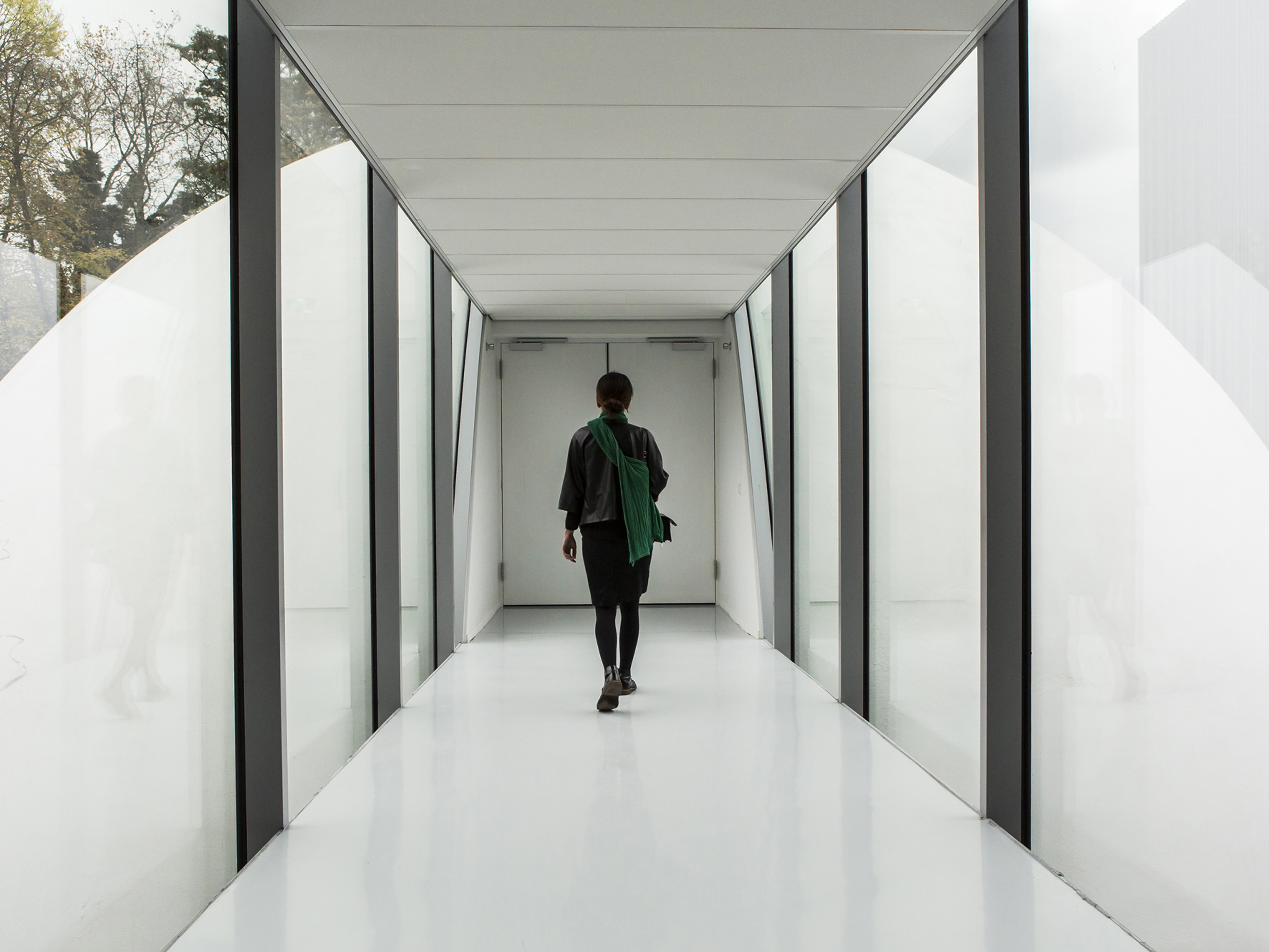
Both the lounge and the restaurant are connected to the carved-out terrace situated at the rear of the building. A four-rail system of sliding windows enables one to open up two-thirds of the total eighteen meters of glass façade. This intensifies the experience of the forest without the visitor having to step outside the building envelope.


The construction principles of the Faculty Club are deceptively simple. In order to emphasize contrasting space and mass, the structure, installations and details are integrated within walls and floors. The starting point for the engineering was the visual absence of technique. Key contractors and consultants were engaged early in the process of preliminary design, enabling the development of precise and project-specific details that consistently support the overall concept.


The result is an integral, durable and engaging building. A monolith carved in such a way as to both profit and profit from the surrounding landscape while maintaining its distinct primary form. Its architecture refers to the heritage of Jos Bedaux by abstracting and updating his formal language. This makes the building into a solidary solitaire, sober and luxurious, massive and transparent, silent and outspoken.


Dentist with a view
The task of this project was to transform and extend a historical house in the centre of Best, a village in the south of The Netherlands, into a dental practice with four treatment rooms. The central question was how the extension responds to the existing architecture and how it profits from the green setting.


The four new treatment rooms are situated in a new volume that at the same time mimics and contrasts the existing house. Its archetypical volume is derived from the existing house – it takes over the exact same inclination of the pitched roof – while it is being materialized in a very different material.


All secondary functions of the dentist practice are positioned in the existing house without harming its structure and typical 1930’s details. The patient enters and waits in a homely and familiar atmosphere that, together with the experience of the surrounding garden from the extension, makes the necessary visit to the dentist in a (slightly) more comforting experience.


A glass corridor separates and connects the new volume to the historical house.


The new volume provides each treatment room with the archetypical space of a miniature house. Its high ridge and steep ceiling results in a vertical space that connects to the perspective of a patient in the dentist chair.


A roof light in each treatment room enables the patients to relate with the outside, even during treatment. A large ‘flower window’, that also serves as a bench, floods the rooms with daylight and provides both the staff and their patients with a framed view of the surrounding green.


Both the roof and the facades of the extension are clad with zinc. This strengthens the iconic quality of the archetype and renders the new extension into a “contextual alien” that blends into the rural surroundings and at the same time creates a clear new landmark that expresses its new function.
